Loose Design System

Deliverables
Design System
/
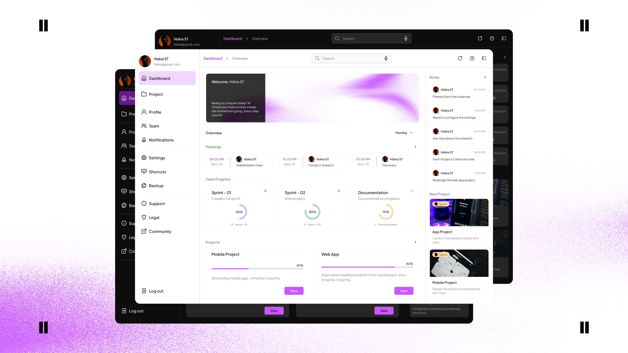
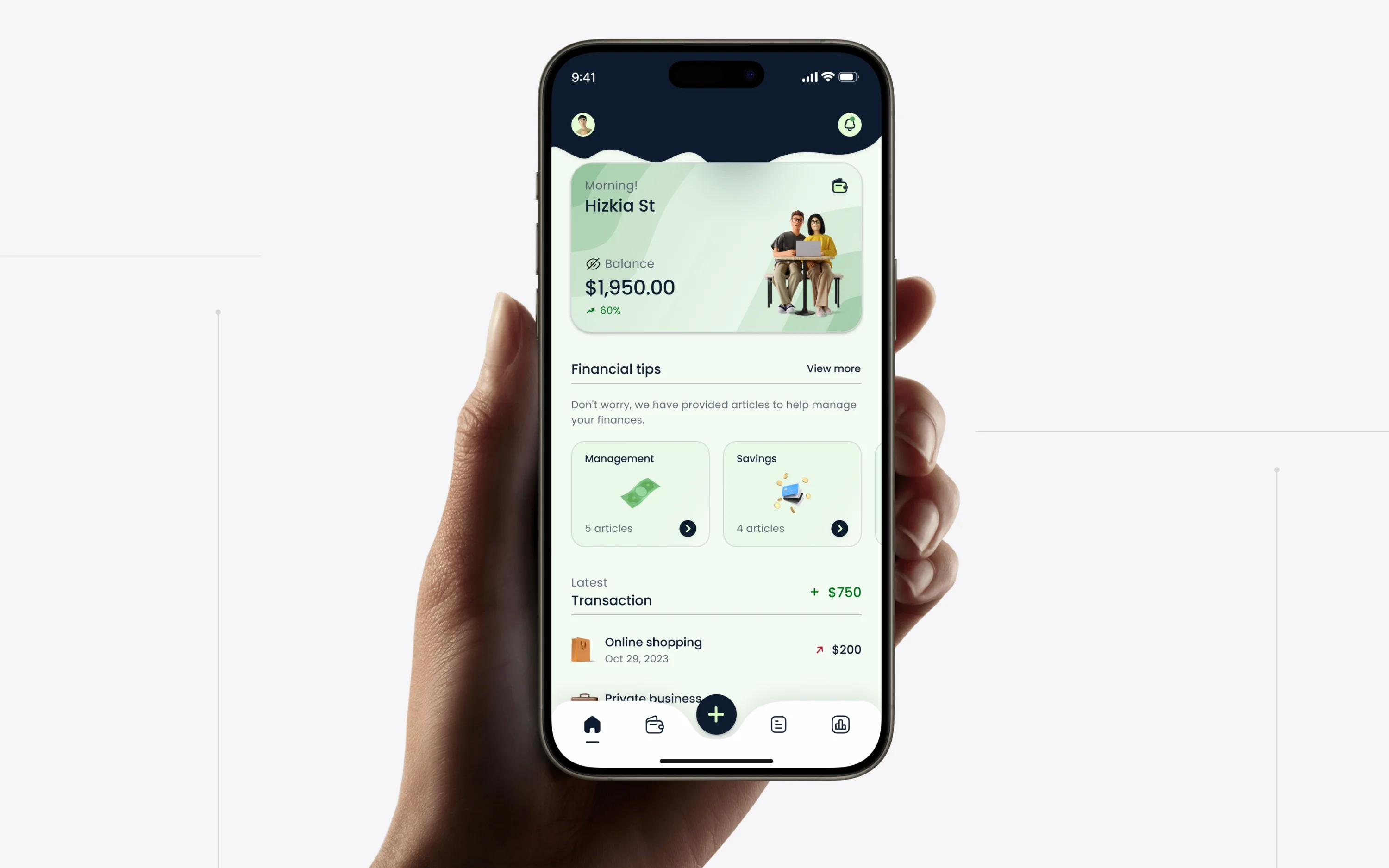
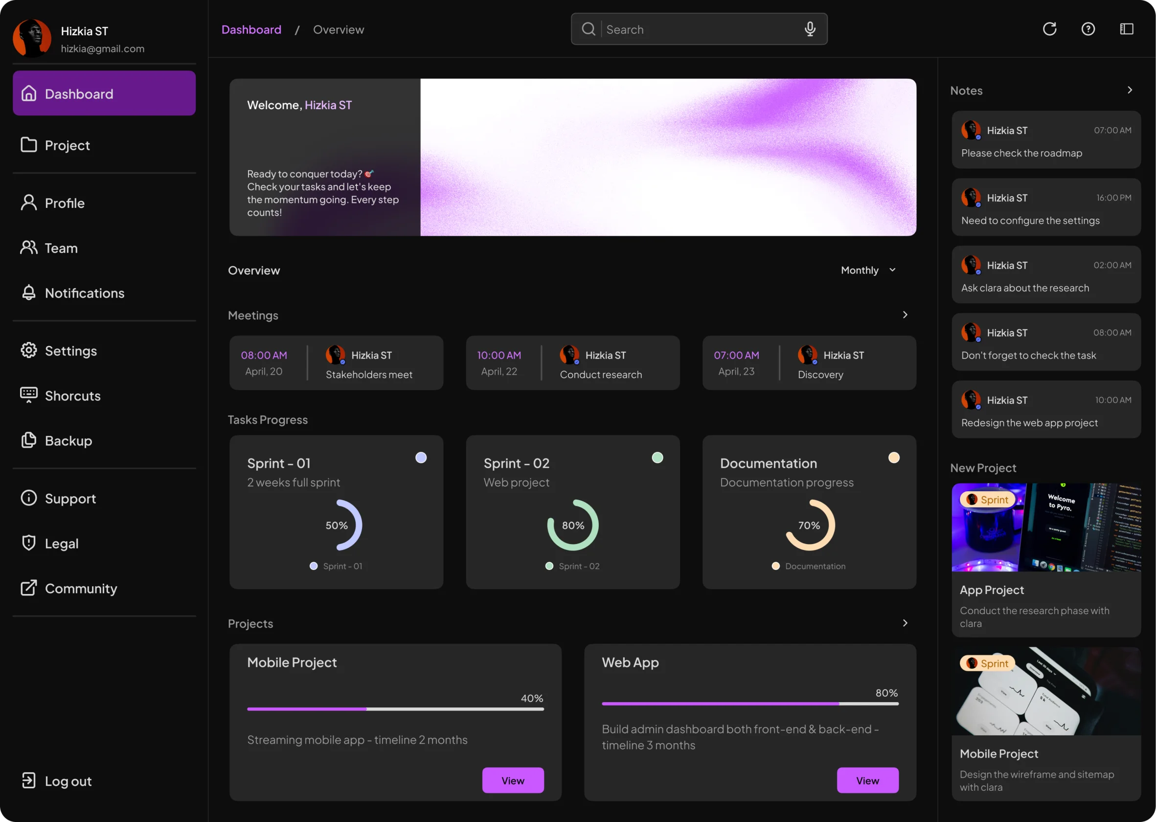
Desktop & Mobile
Year
2025
Timeline
3 - 6 Weeks
Access Link
Introduction
Flex Your Concepts, Simplify Your Steps
Loose is a design system designed to emphasize clarity of information, consistent style, and minimalist components in the design system, while encouraging exploration and flexibility in the use of design components and design development.
Loose was designed with the principle that even the most consistent systems need flexibility. It provides a simple, clear foundation that support creativity and iteration. It's designed to help the team build products without starting from scratch.
Challenges
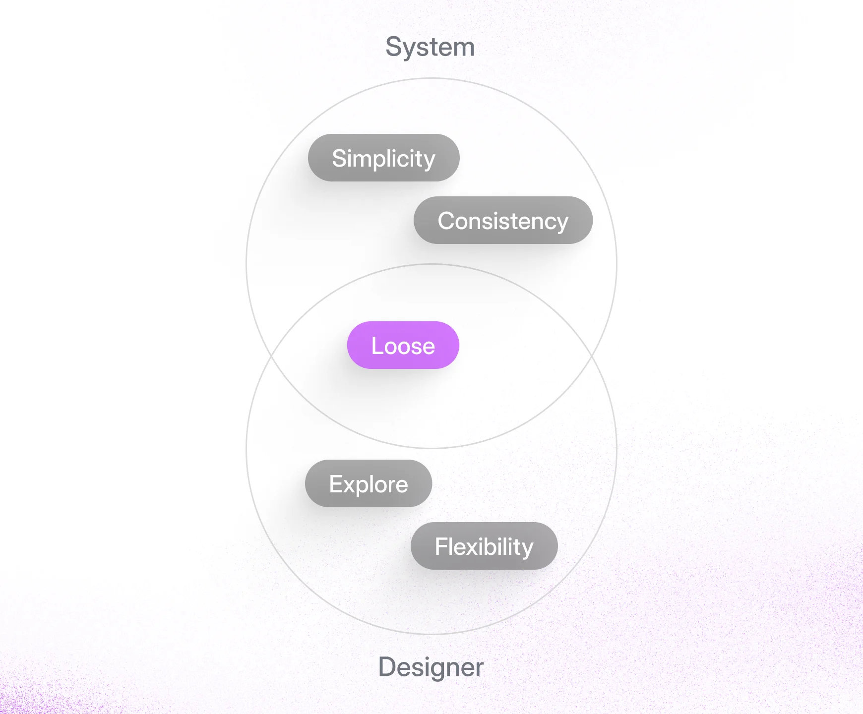
The core challenge was to combine and balance two opposing needs: the system required simplicity and consistency, while designers needed the flexibility to explore and innovate. The goal was to provide clear guidance without being creatively restrictive.
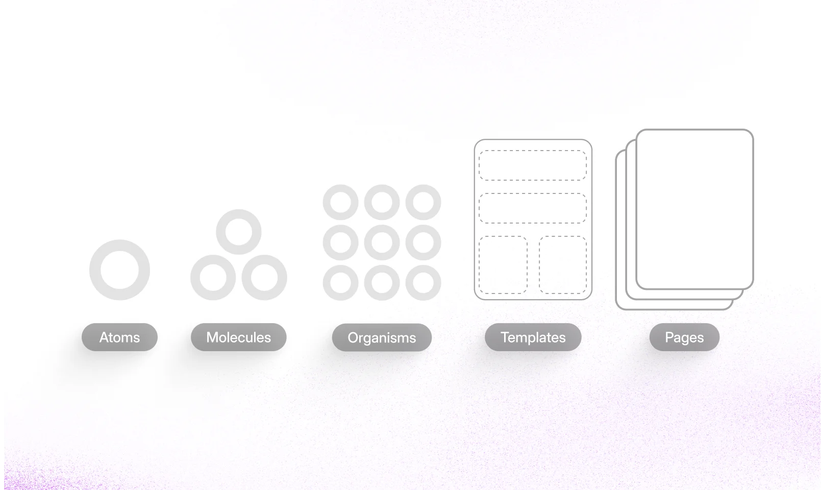
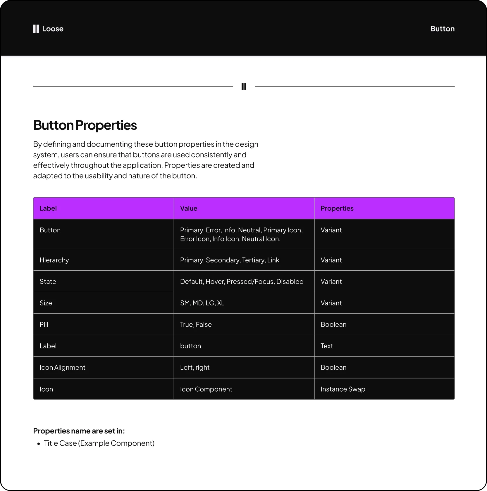
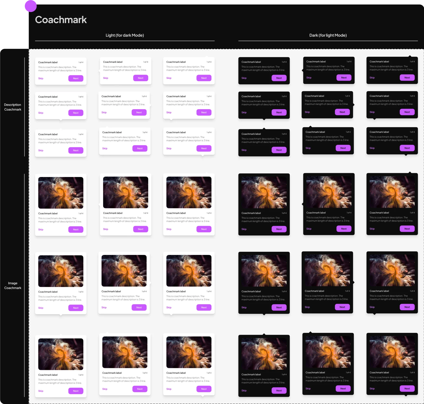
Atomic Design Approach
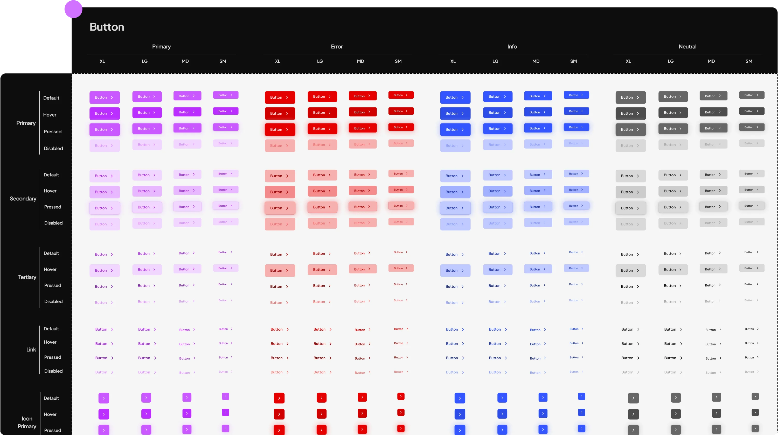
The Loose design system was built using the Atomic Design methodology. This approach breaks down interfaces into fundamental building blocks, which promotes consistency, modularity, and scalability across the entire product ecosystem.
Solutions
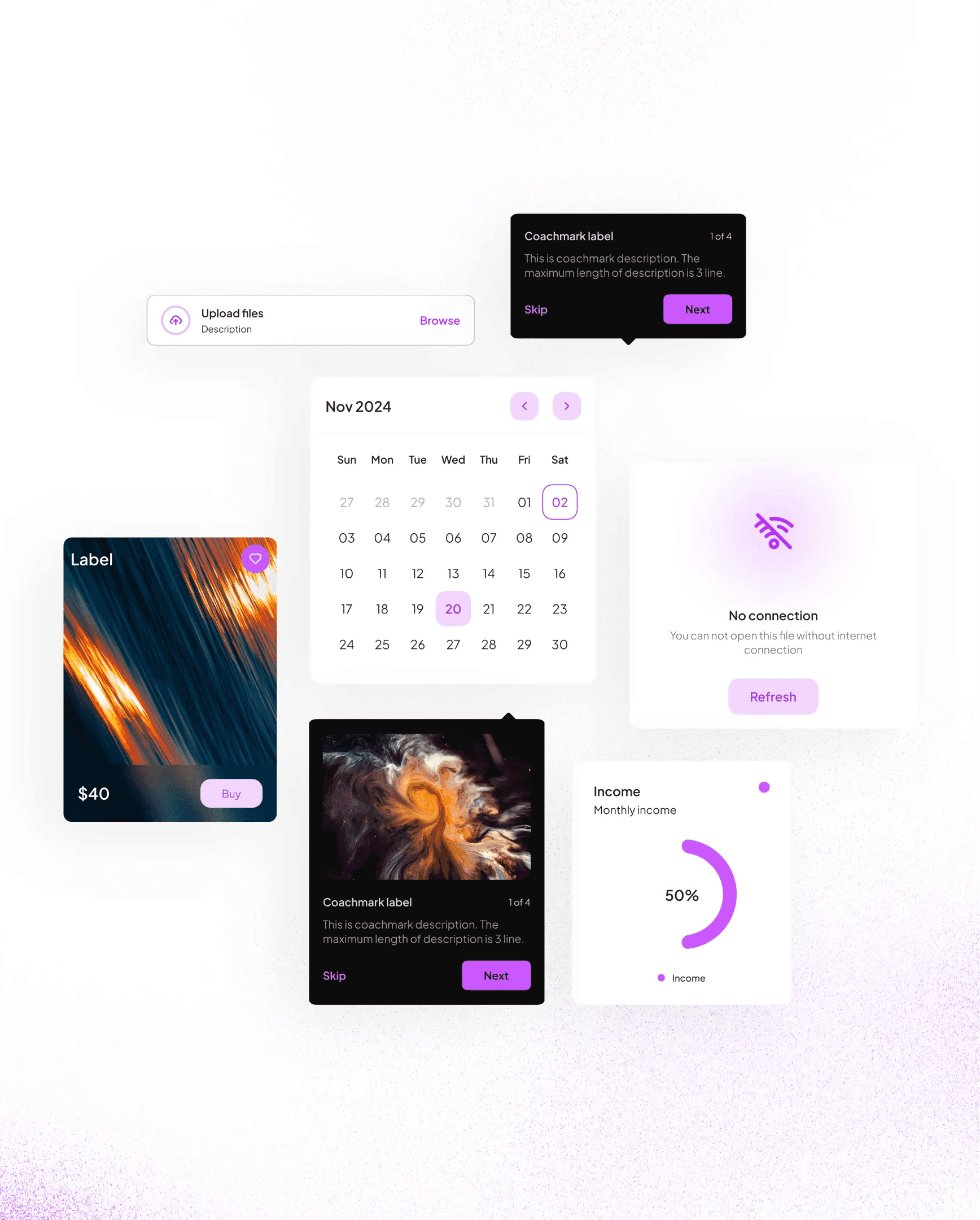
The solution was to create a modular system. This provides a strong foundation of consistency while allowing for creative flexibility and exploration.
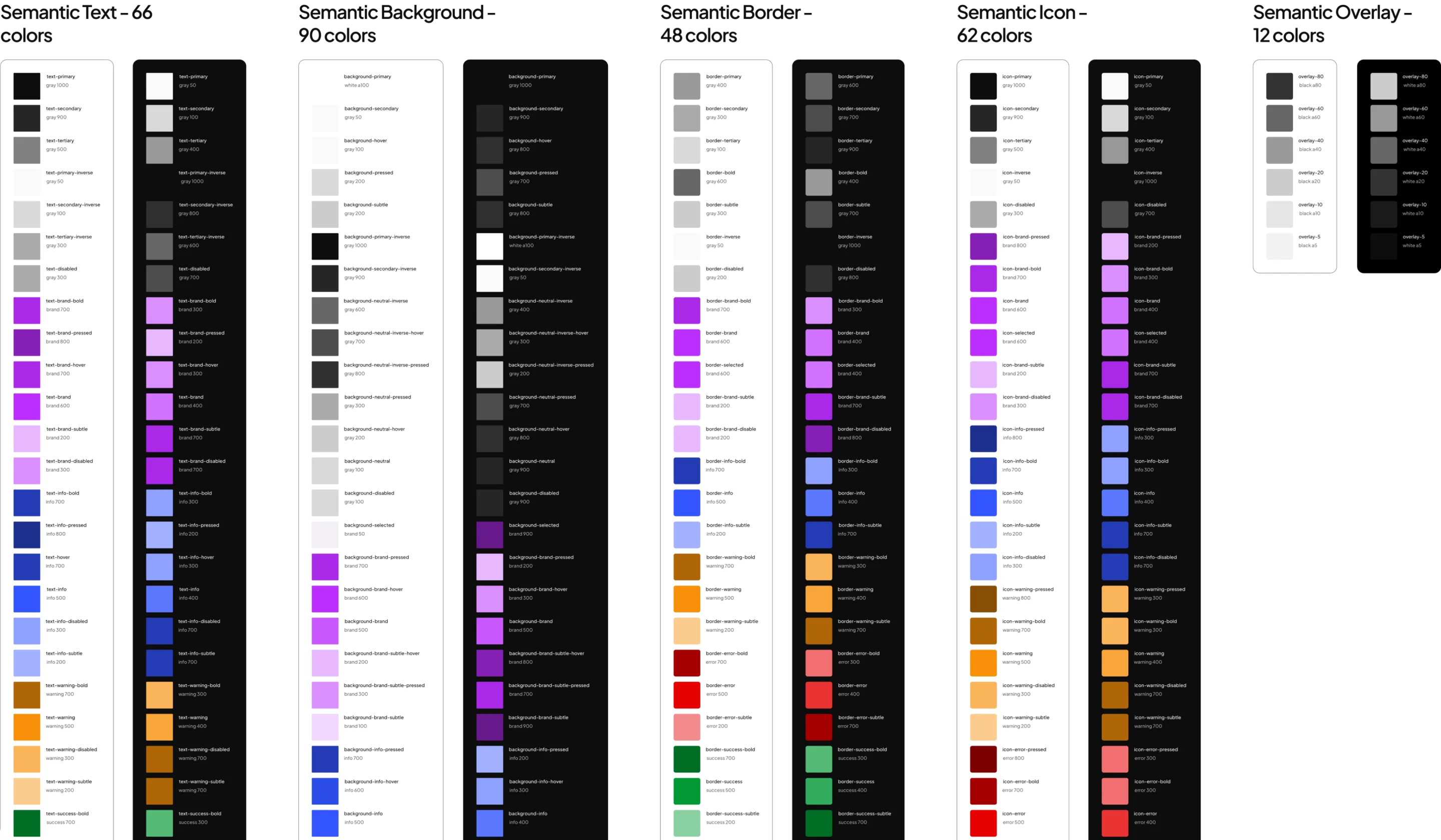
Consistent styles using scalable design tokens.
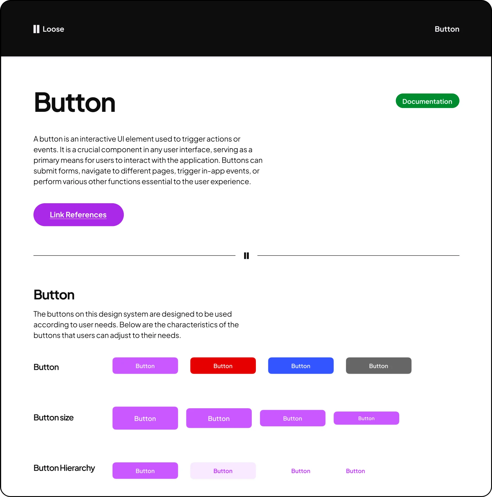
Modular components with variants for flexibility.
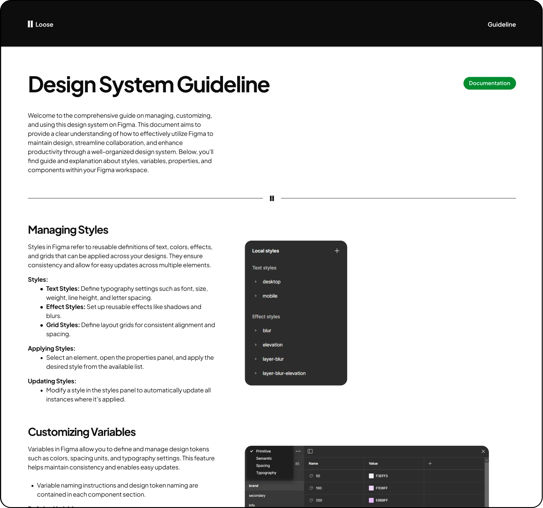
Clear documentation that encourages exploration.
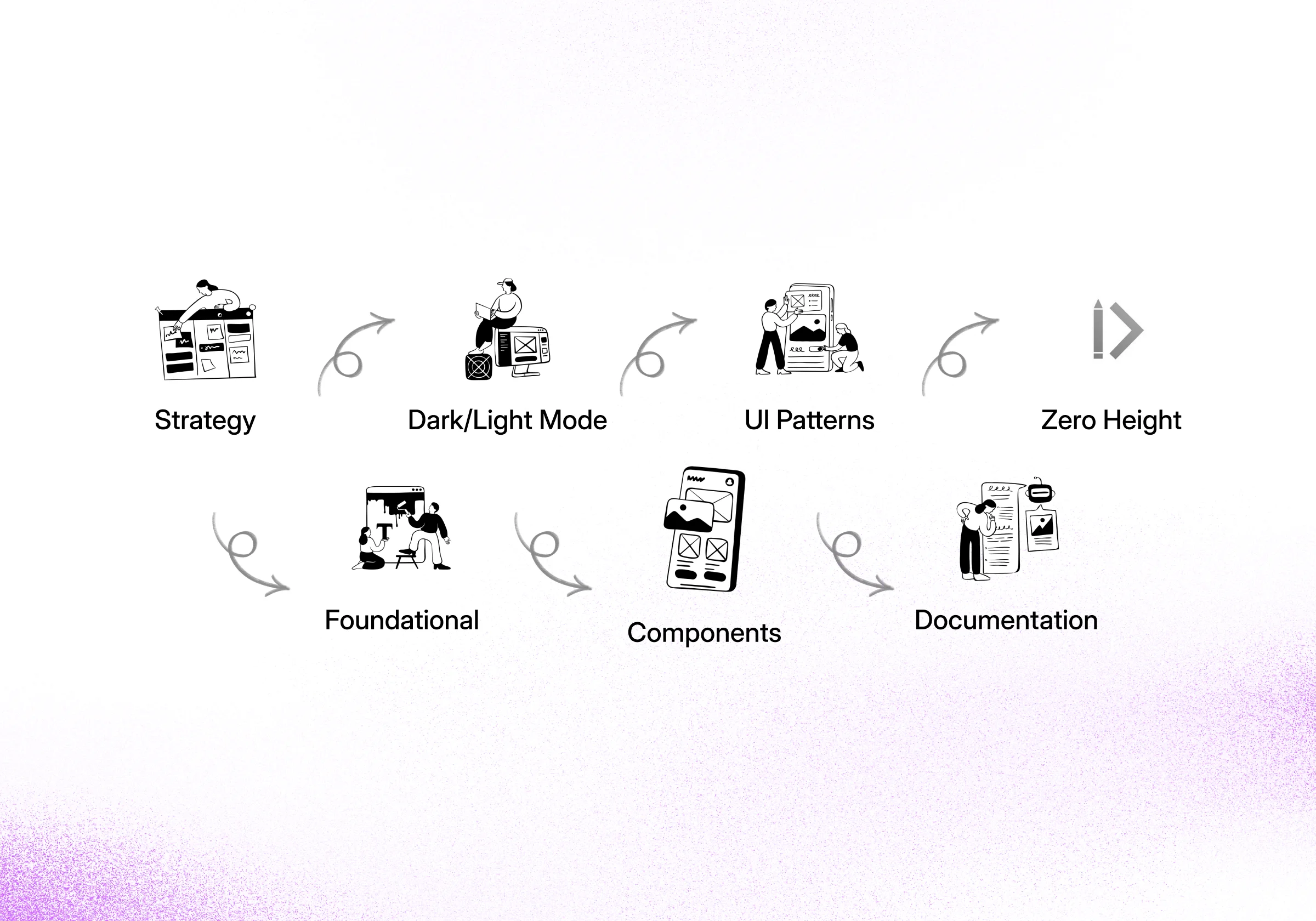
Process
My process started with a foundational strategy for the design system. I then designed and built a robust library of UI patterns and core components, ensuring full support for both Dark and Light modes. All standards were captured in clear documentation.
Outcomes
The final outcome is a comprehensive and scalable design system. It includes 6 foundational systems, a robust component library with 4700+ variants, and full documentation.
Total Component Variants
Color Tokens
Foundational Systems
Main Components